|
|
 |
|
|
|
Welcome to the Australian Ford Forums forum. You are currently viewing our boards as a guest which gives you limited access to view most discussions and inserts advertising. By joining our free community you will have access to post topics, communicate privately with other members, respond to polls, upload content and access many other special features without post based advertising banners. Registration is simple and absolutely free so please, join our community today! If you have any problems with the registration process or your account login, please contact us. Please Note: All new registrations go through a manual approval queue to keep spammers out. This is checked twice each day so there will be a delay before your registration is activated. |
|
|||||||
| The Pub For General Automotive Related Talk |
|
|
Thread Tools | Display Modes |
|
|
#11 | ||
|
Away on leave
Join Date: Apr 2019
Location: ACT
Posts: 1,735
|
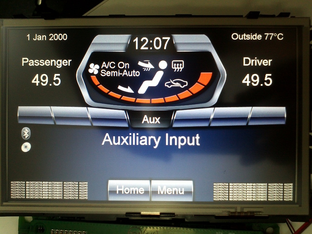
I'm no artist, so dials are a fair bit off, but I decided to create a basic font (small enough to use with dials in the space I've got to play with). Uppercase and digits only, it's easy to add symbols to though...
 I reckon I could get 6 dials in that space. 3 each side. Currently I'm showing 7 lines of text by 55 characters each side. I could get a lot more info in here this way - if only I could read it! There was a lot of flicker in the text when I first ran this test, so I create a handle to the orginal surface and created my own new one. I refresh my new surface from a copy of the old surface 4 times a second (works well) - flicker has almost gone. (The flicker is because there's 2 apps updating the surface, and I can't coordinate mine against the original - but by taking a regular snapshot I can coordinate when mine gets displayed - in the vertical retrace of the screen (a 47Hz LCD screen) to reduce the flicker. I am thinking though, with basic line drawing, I can set something up like this: 30C--------------80C--------------130C OIL-------------------------| TRN----------------------| WTR--------------------| Which would be quite readable. Did I mention, I'm no artist? 
|
||
|
|

|